The Bulletin Gets a Makeover:
How the university's cork-board bulletin moved to our screens.
Note: This case study was completed as a small project intended to provide suggestions for the website and mobile app of a universitry organization. This case study occasionally mentions challenges, which were required guidelines to follow. Thank you for reading!
Challenge #1: COMPLETELY redesign the home page and two other pages of your choice on the app AND website (can be an individual event page, organization profile, favorited list, organizer portal, etc.) Consider elements such as improved filtering options (by date, event type, category, etc.) to enhance the user experience.
Challenge #2: There are 3 features we want to add:
- A feed of events and applications of organizations you're following.
- A feed of external events hosted by Columbia clubs or departments.
- A feed of opportunities for alumni.
Project Overview
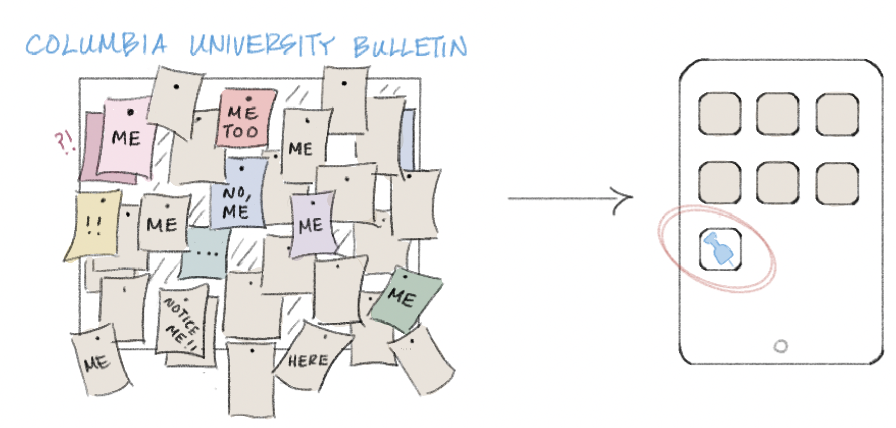
The Bulletin is a virtual "bulletin board" of all events and opportunities happening at Columbia University. Created through the frustration of overwhelming amounts of flyers plastered along the walls of Columbia's buildings-- just to be covered by other posters-- The Bulletin resolved the conflict of organizations competing with one another to grasp the attention of passing students. Currently, it is the most comprehensive, "one-stop destination" for both students and organizations to connect efficiently at Columbia University.
Exploring the Problem
All of the university-wide events, programs, and various opportunities for students were finally gathered and accessible at their fingertips. Cultural clubs, pre-professional organizations, and even employment opportunities quickly populated the platform. The Bulletin continues to get more engagement from students seeking community as the semester progresses but despite successfully gathering so many students together through shared interests, a new challenge arises: digital clutter.
Problem Statement
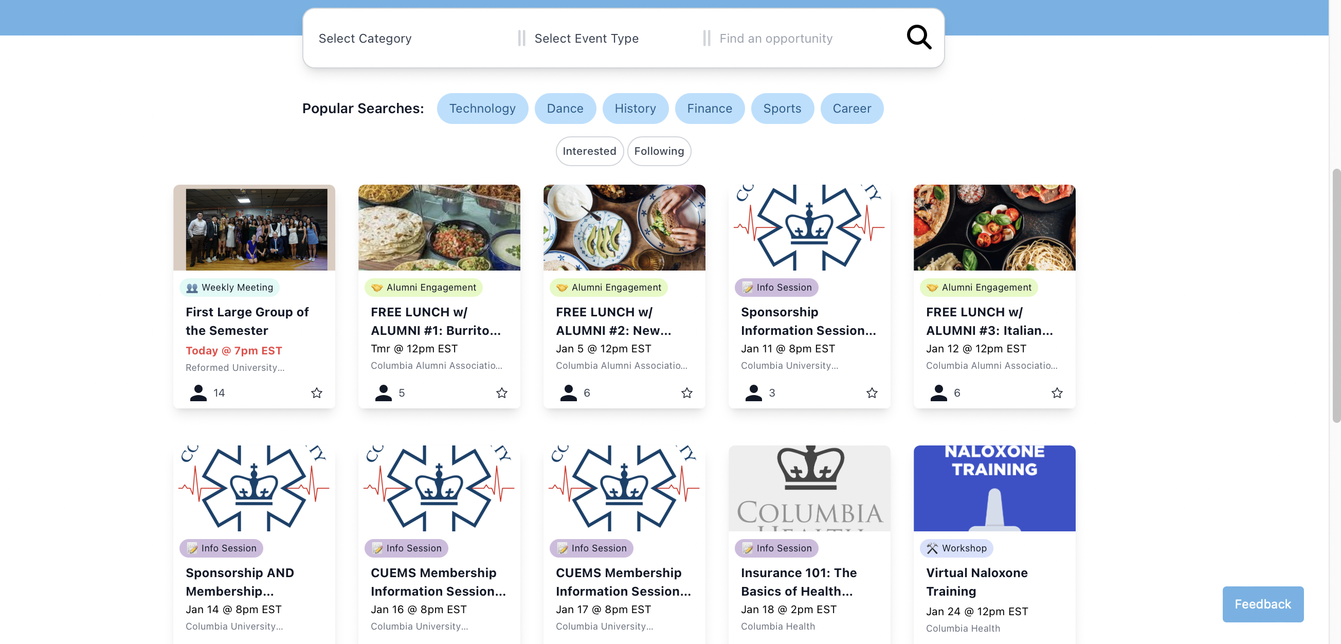
There is an overwhelming amount of information accessible for students with little structure. The current organization of both the website and mobile app is reminiscent of a classic bulletin board's qualities: full of opportunities, tons of meeting dates and times, dissimilar clubs placed side-by-side, and a broad display that makes it difficult for users to fixate on one opportunity at a time. Nostalgia aside, there must be a better way to restructure the vast amount of information. To resolve this problem, a different organization system coiuld be created that has a stronger effect than the exhaustive filter options at the top of the screen.
Tools Used: Timeframe: Inspirations:
3 days
The Design Process
1. Interview target users
2. Ideate user workflows
3. Wire framing
4. Prototyping in Figma
1. User Interviews
The target demographic for The Bulletin is quite simple: university students seeking to spread/learn about current opportunities on campus. The first thing I did was conduct interviews with my peers who have been on the user-side of The Bulletin.
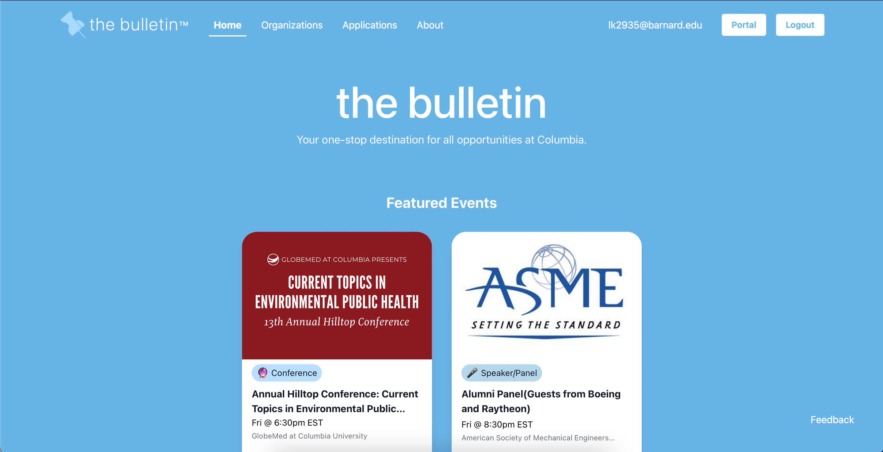
This was the iniital homepage of the website:
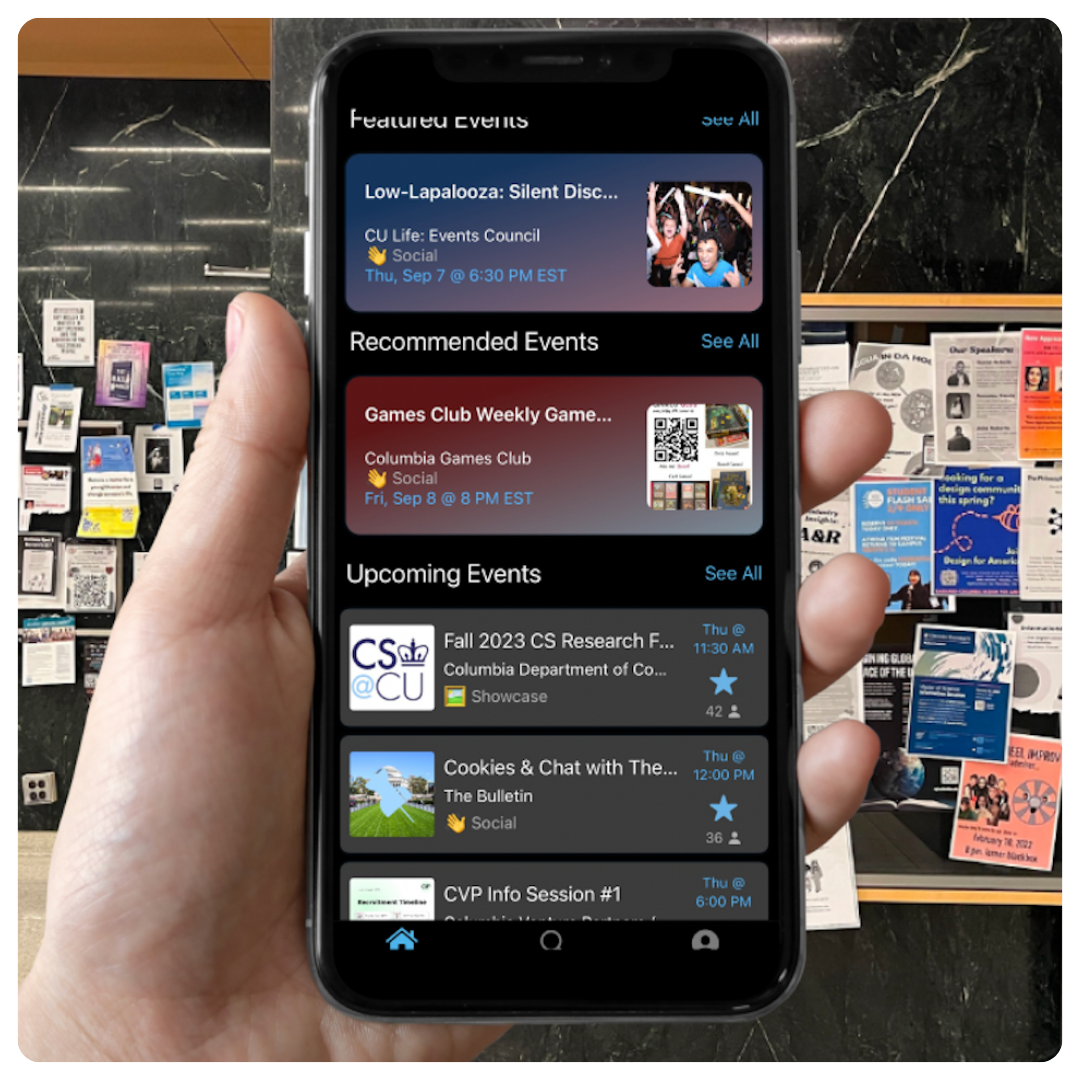
And this was the initial design of the mobile app:
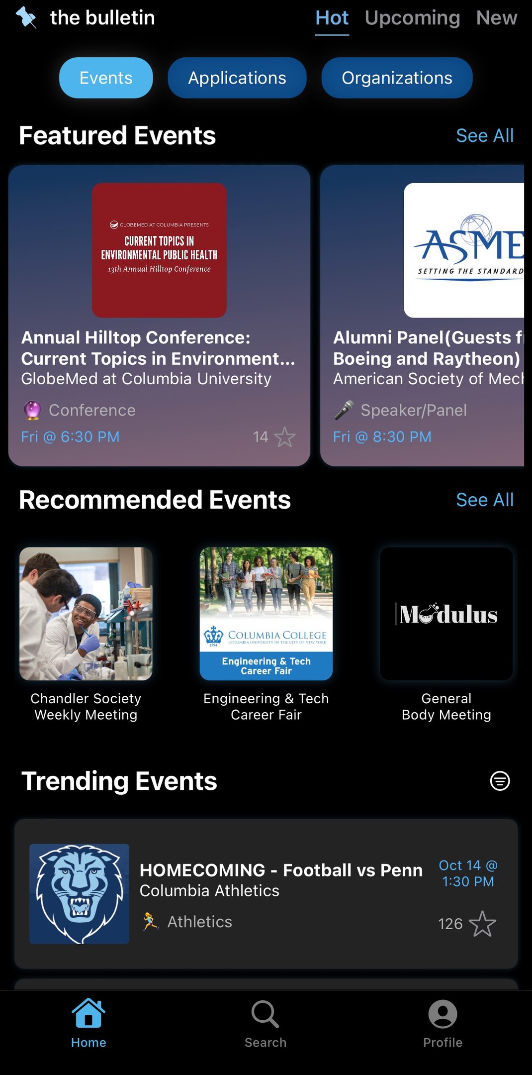
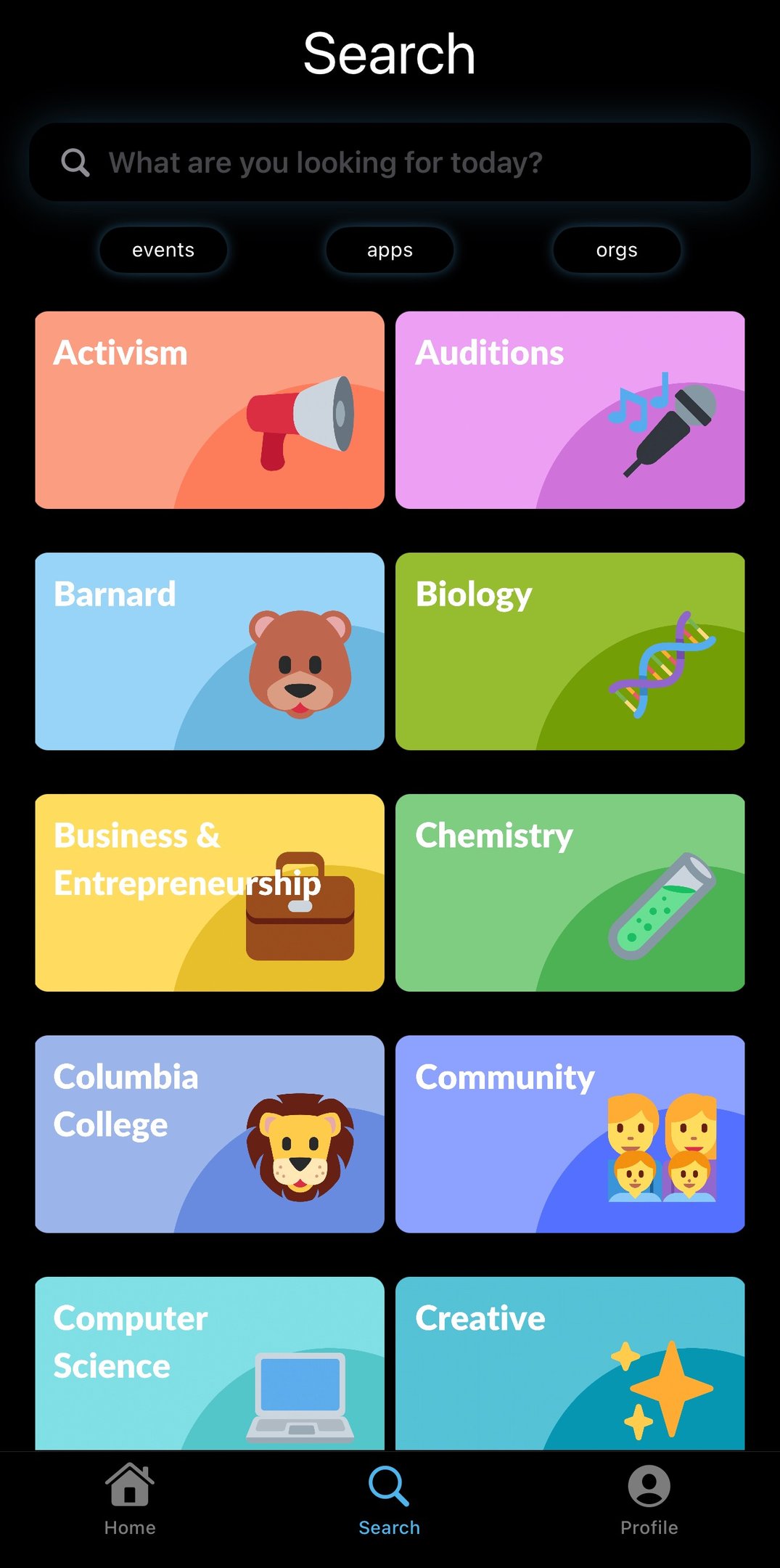
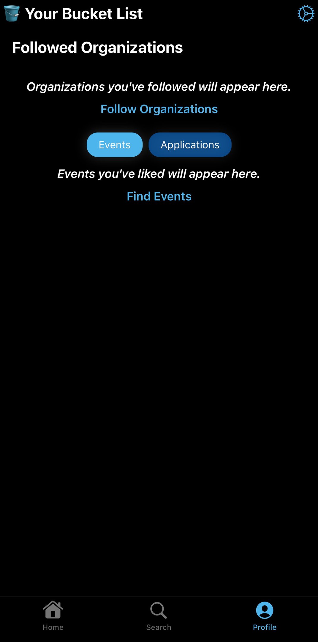
There were key takeaways I wanted to keep in mind for The Bulletin's makeover:
Website:
Mobile App:
- There are too many dates, times, and deadlines that seem to flood the screen
- The juxtaposition of different clubs feel disorganized and overwhelming.
- It is difficult to move within the app; a lot of scrolling back up/down to find a specific event.
- The app is not consistent with the webpage in terms of structure and typography. The app has "Recommended Events" and "Trending Events" while the webpage has "Made for You" and "Popular Searches."
2. User Flows
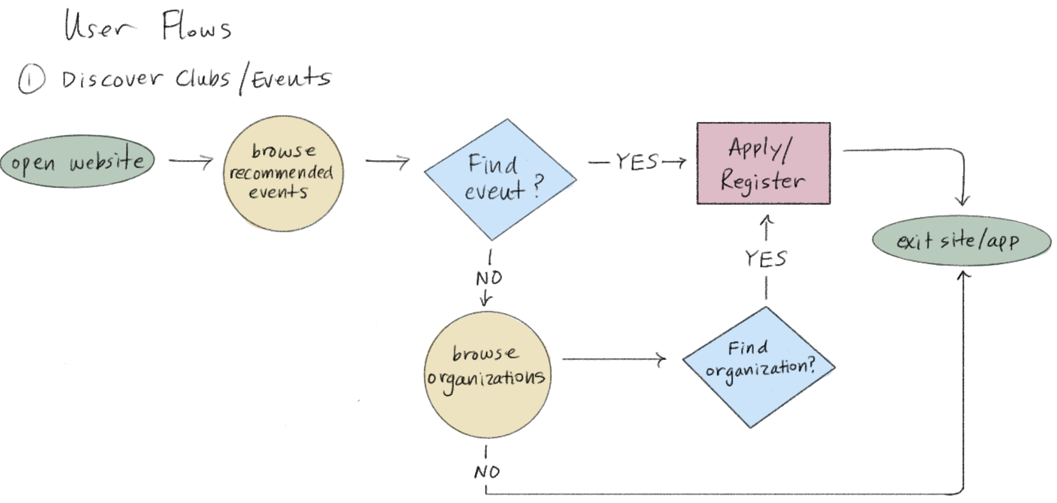
I created three user flows based on activities that the user would do on The Bulletin.
I wanted to envision a flow that would increase the number of new student users and encourage their discovery of various organizations. After all, this platform is a virtual bulletin of everything and anything at Columbia + NYC. All students and organizations should feel connected and welcome.
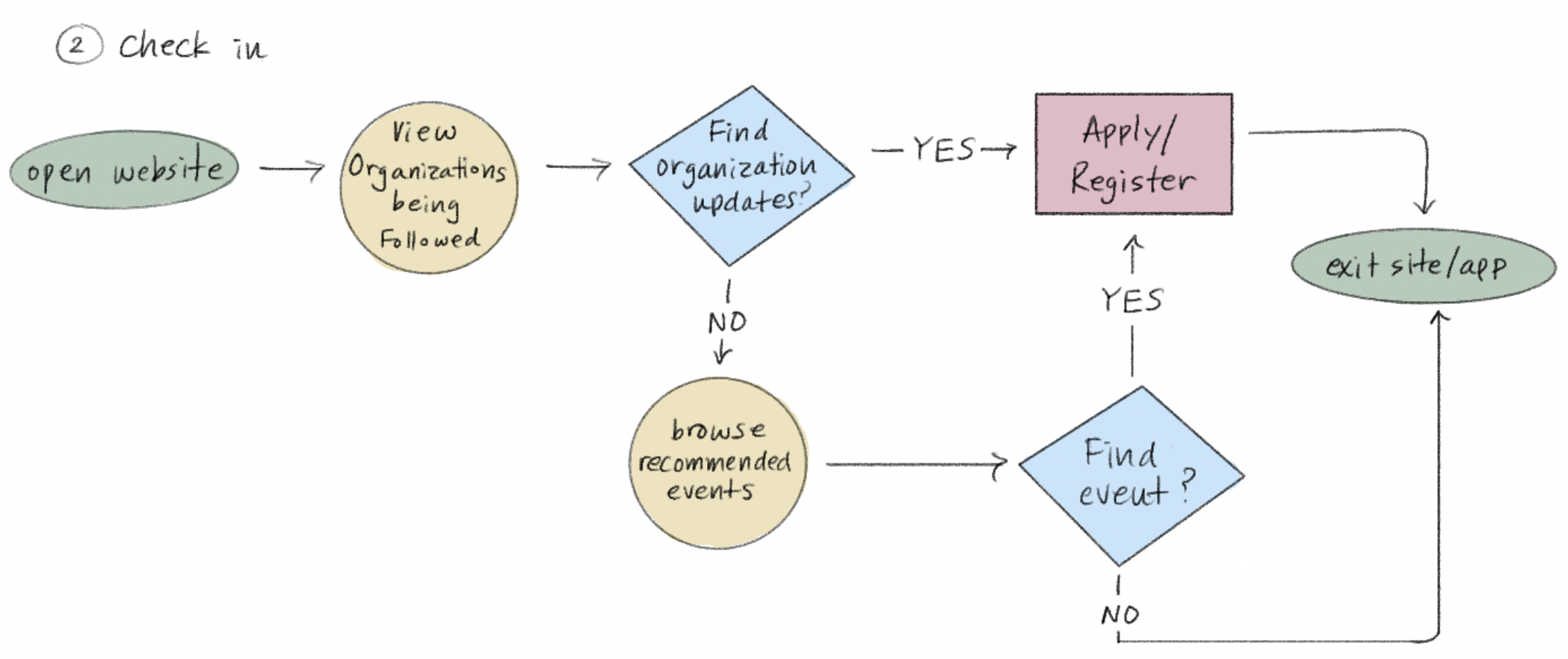
I decided that the platform should consistently inspire students to "browse" more through subtle recommendations of new events and opportunities on as many pages as possible.
Creating these user flows allowed me to empathize with both students and organizations, which completely transformed my approach to redesigning The Bulletin.

3A. The Wireframing Process: Website
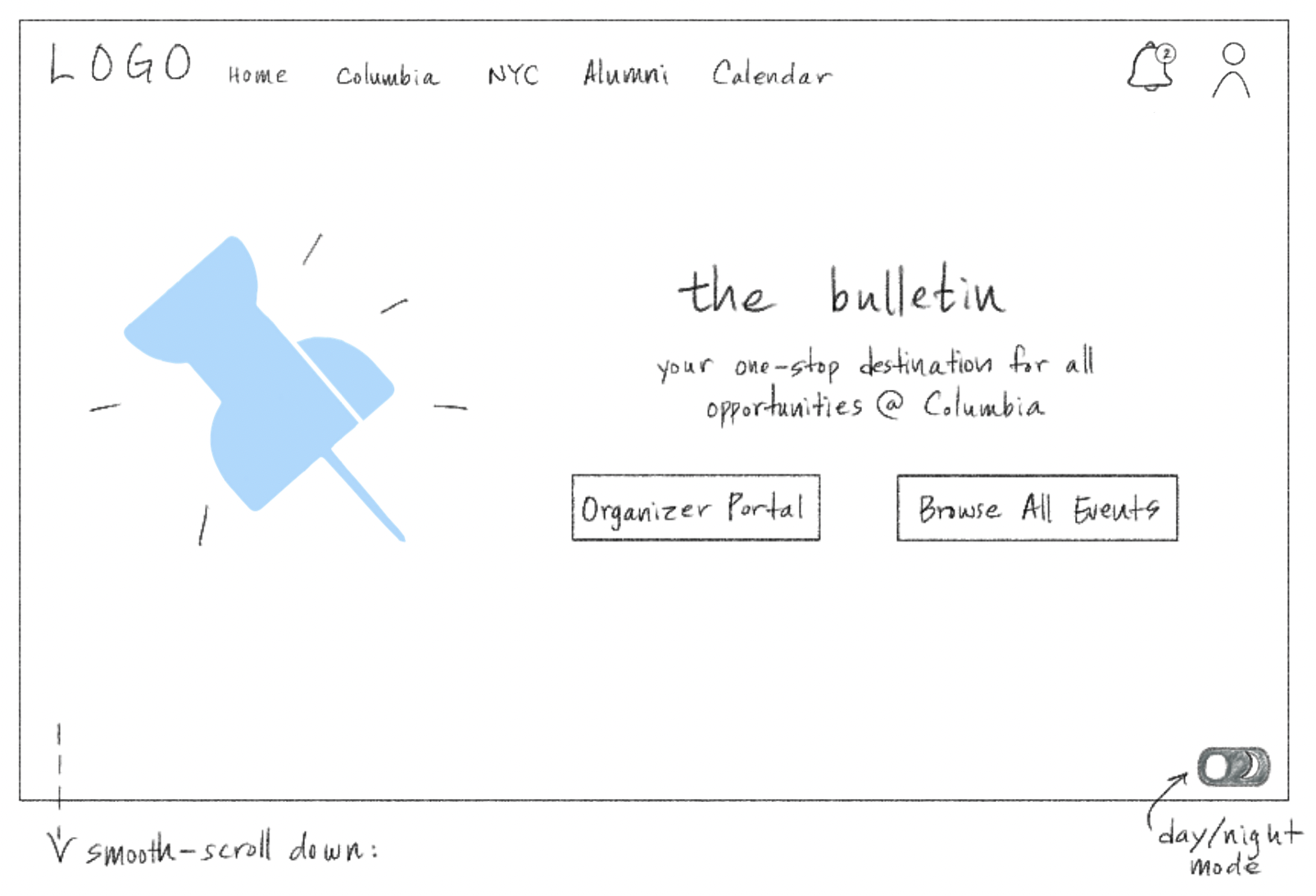
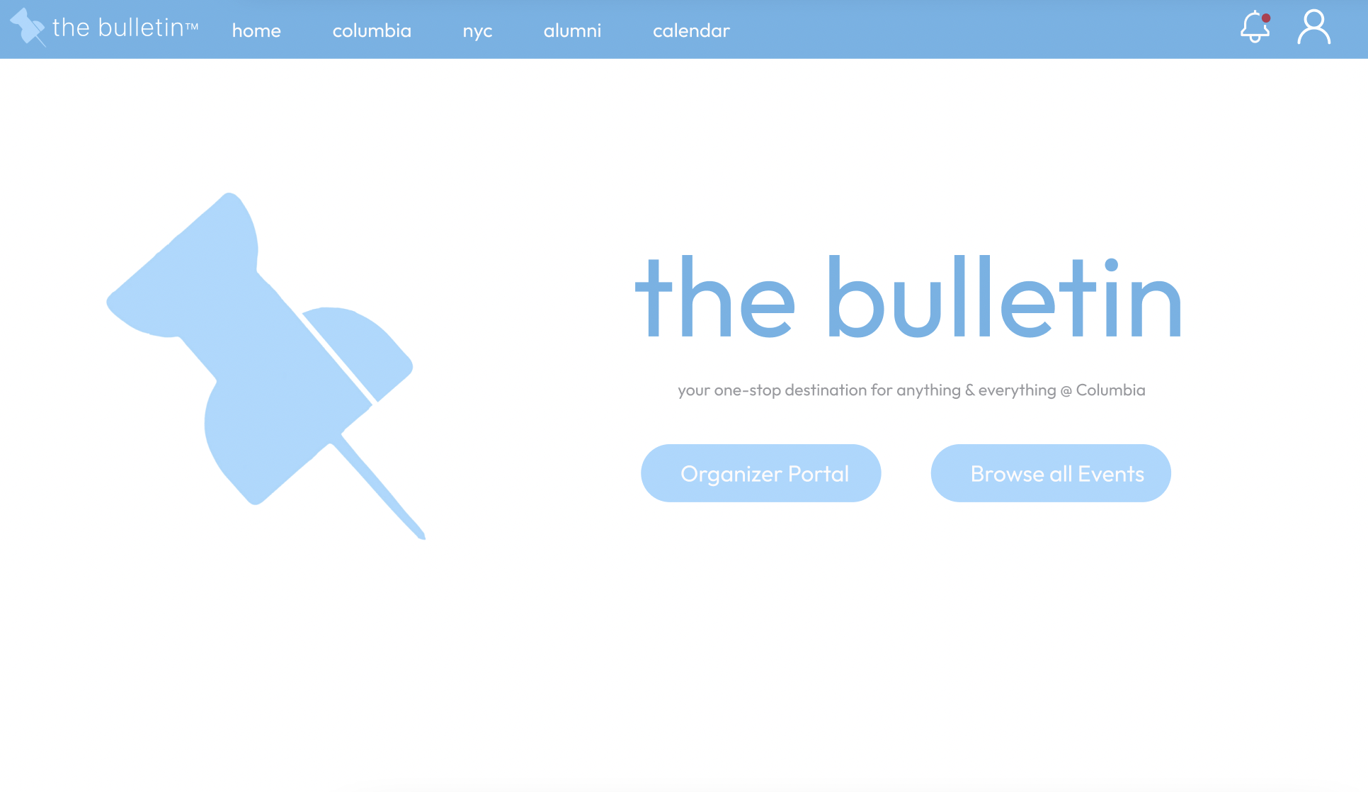
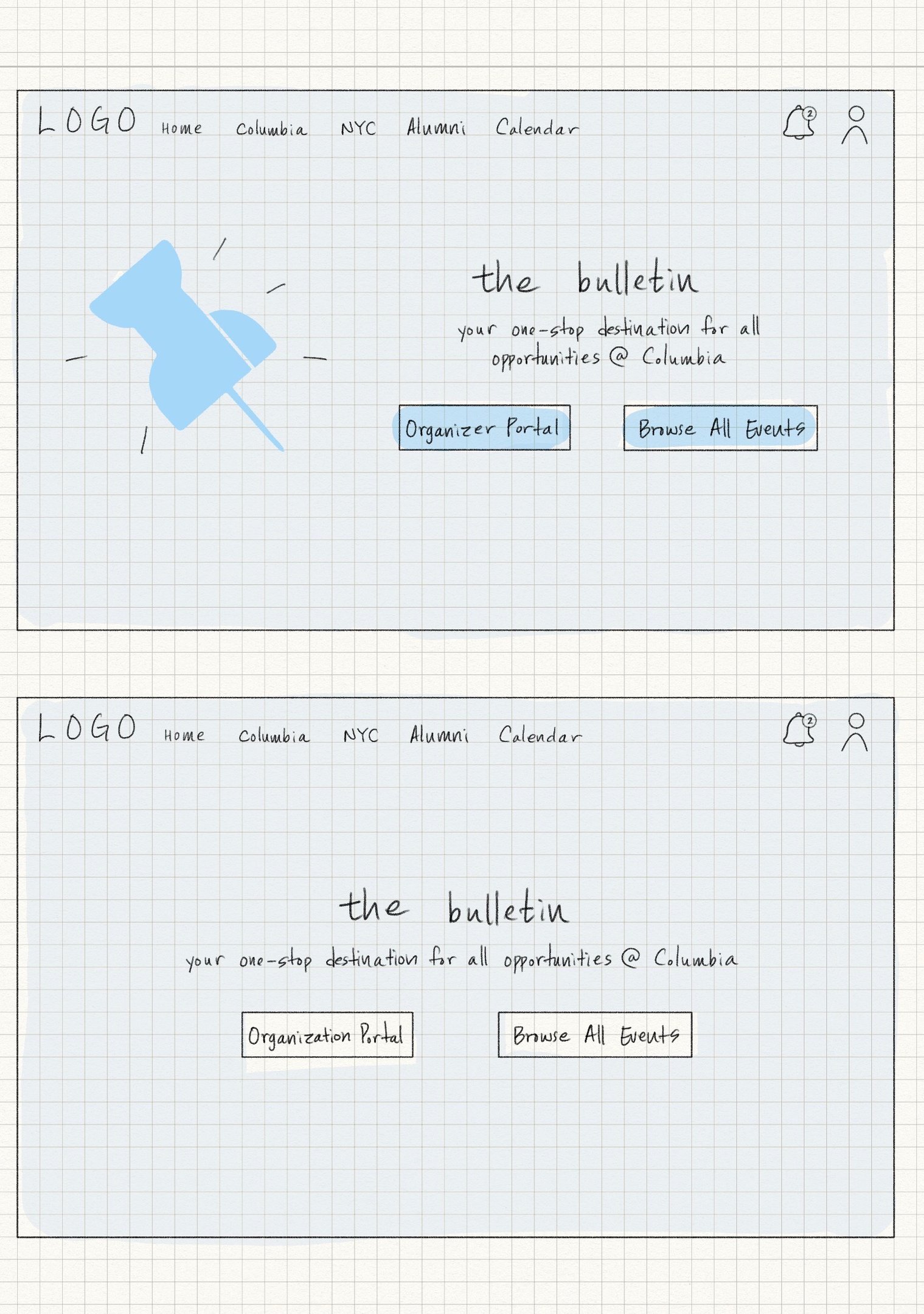
My first challenge was to re-design the homepage.
Reconstruction of the feed was a primary goal of my project, therefore I added a "Browse All Events" option that would lead to a page full of all events in randomized order-- to preserve the classic corkboard style of a university bulletin.
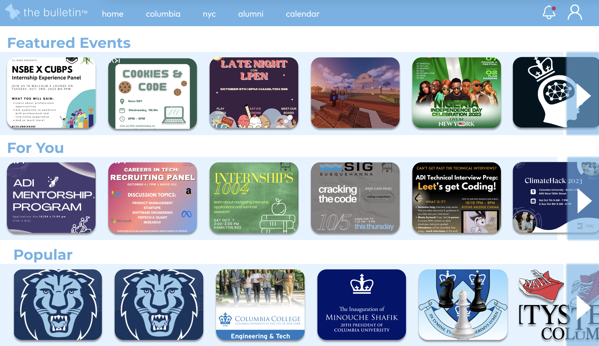
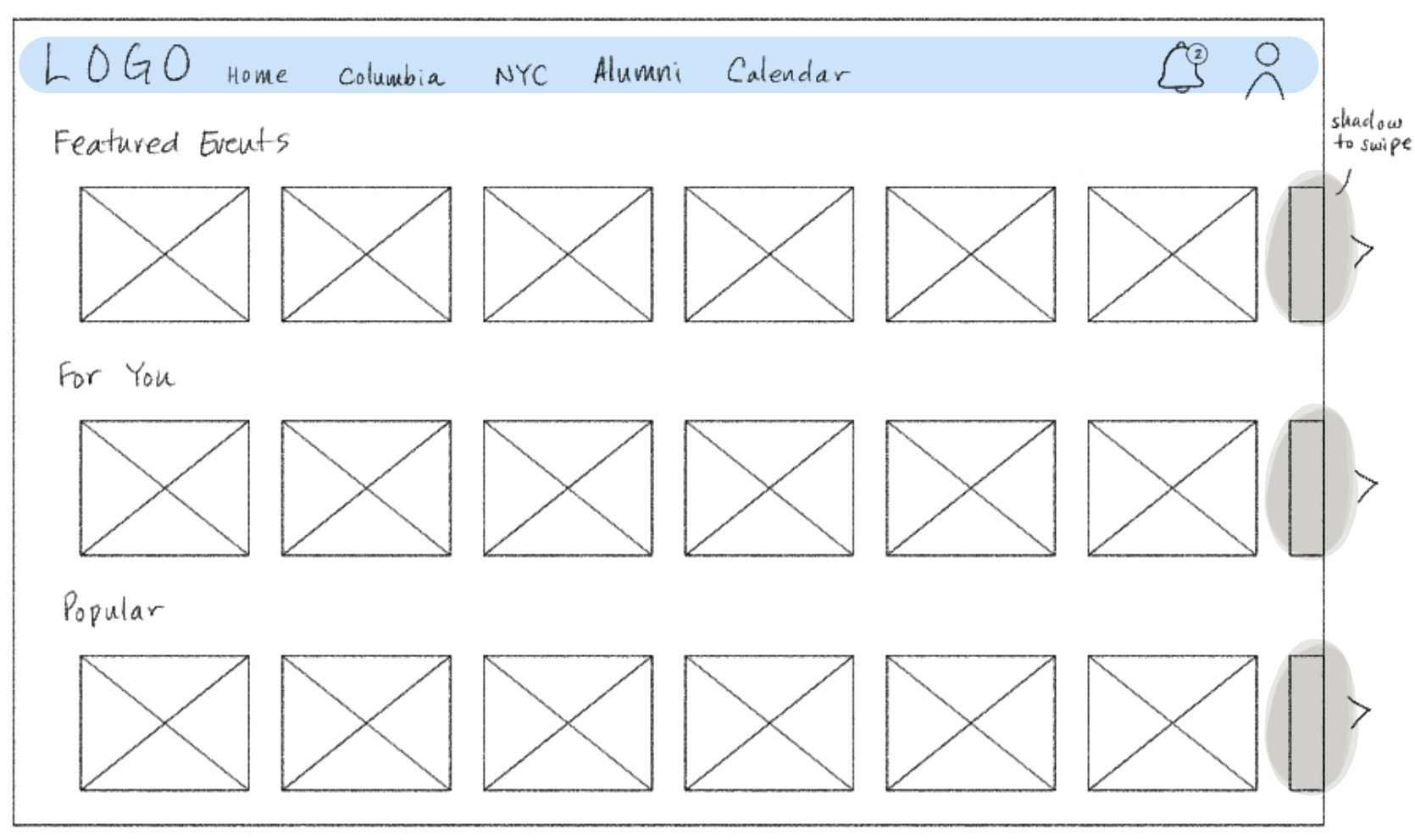
Based on researching common media platforms such as Netflix, Spotify, and Instagram, I decided the best way to compact various categories of events would be through a gallery-like view that sorted Columbia and NYC events. This way, users can quickly observe category titles and decide if they would like to continue exploring or select specific events.
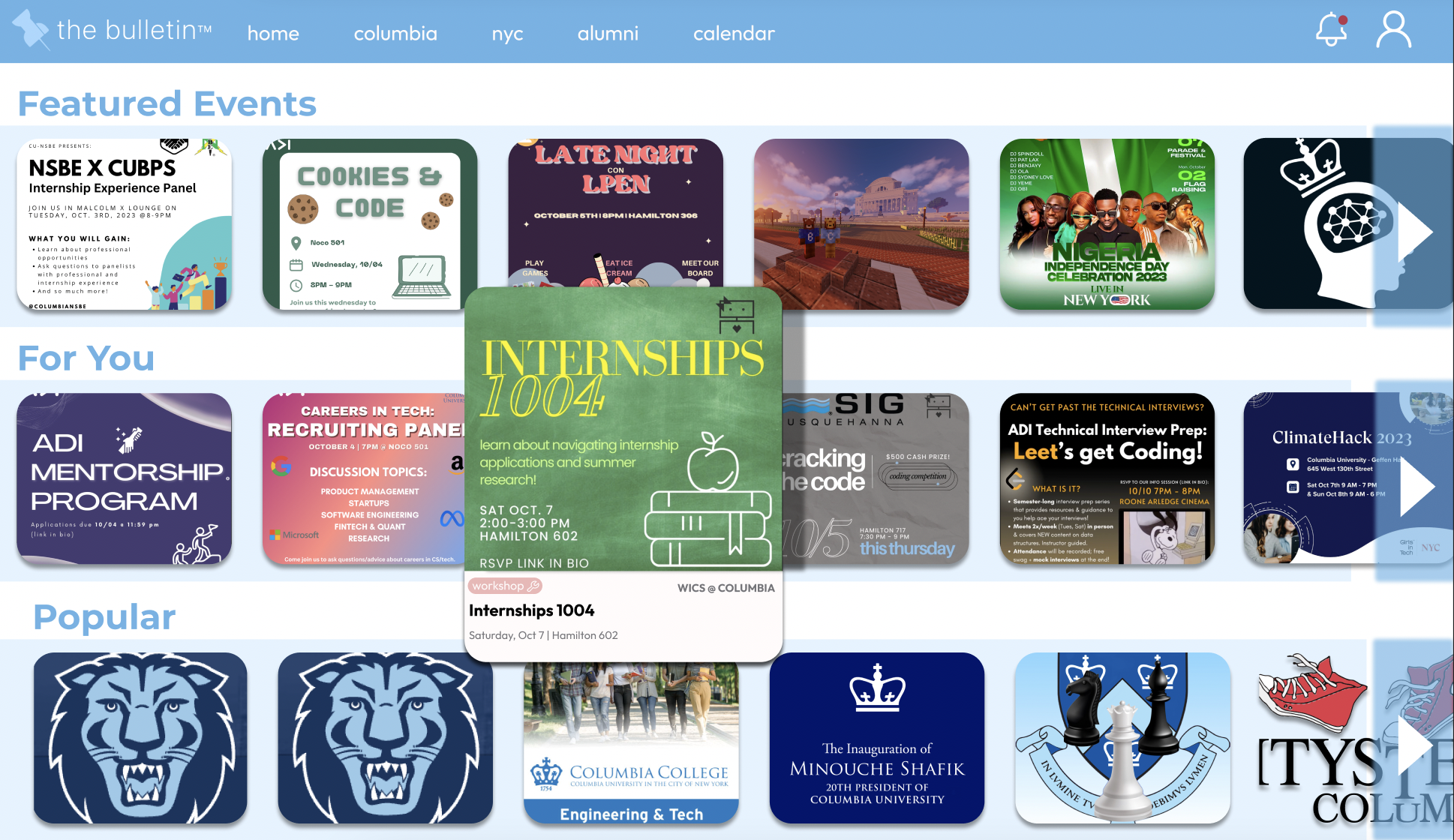
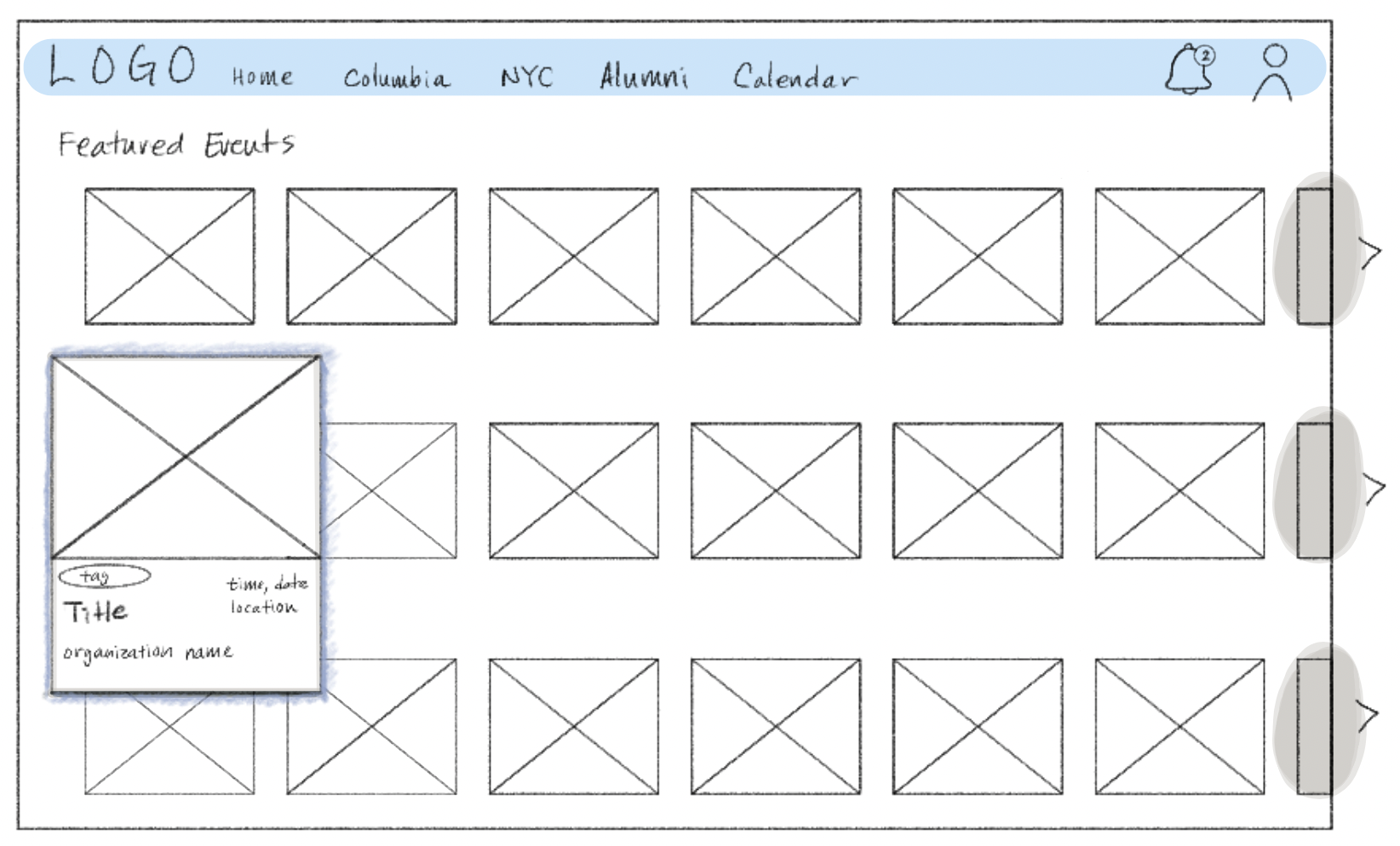
In order to save space that had previously displayed complete information about the club, meeting time, and relevant tags, I decided to omit that detail in the gallery view. Instead, the user can hover over a specific event to see all of its details.
This re-design process concurrently completed segments of Challenge #2.
Key Changes to the Homepage:
- Gallery view of events and opportunities.
- Events in the gallery view are sorted by date, deadline, and time.
- Specific organization details are only visible when the user hovers.
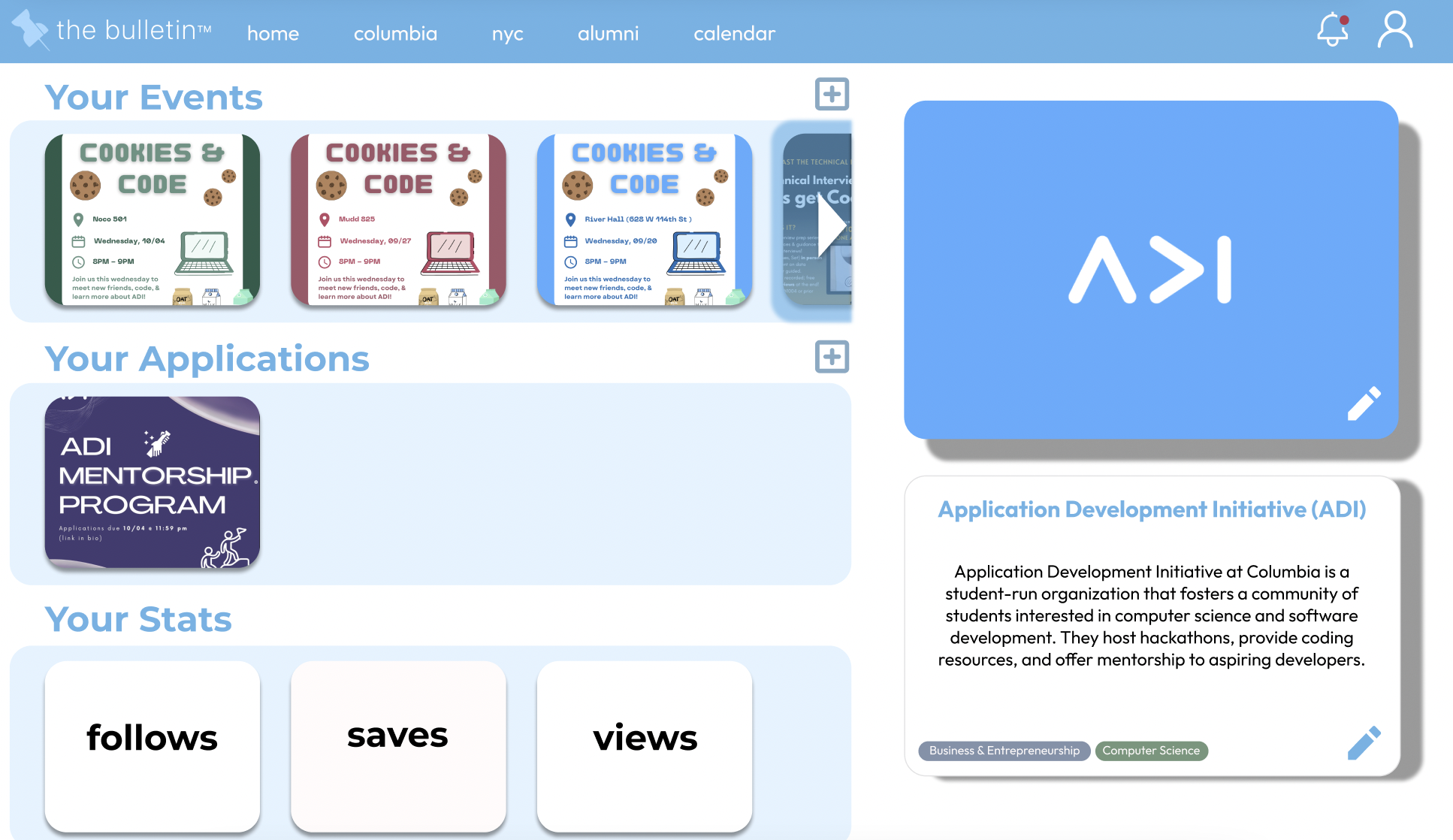
- The "For You" category consists of opportunities posted by organizations that the user is following.
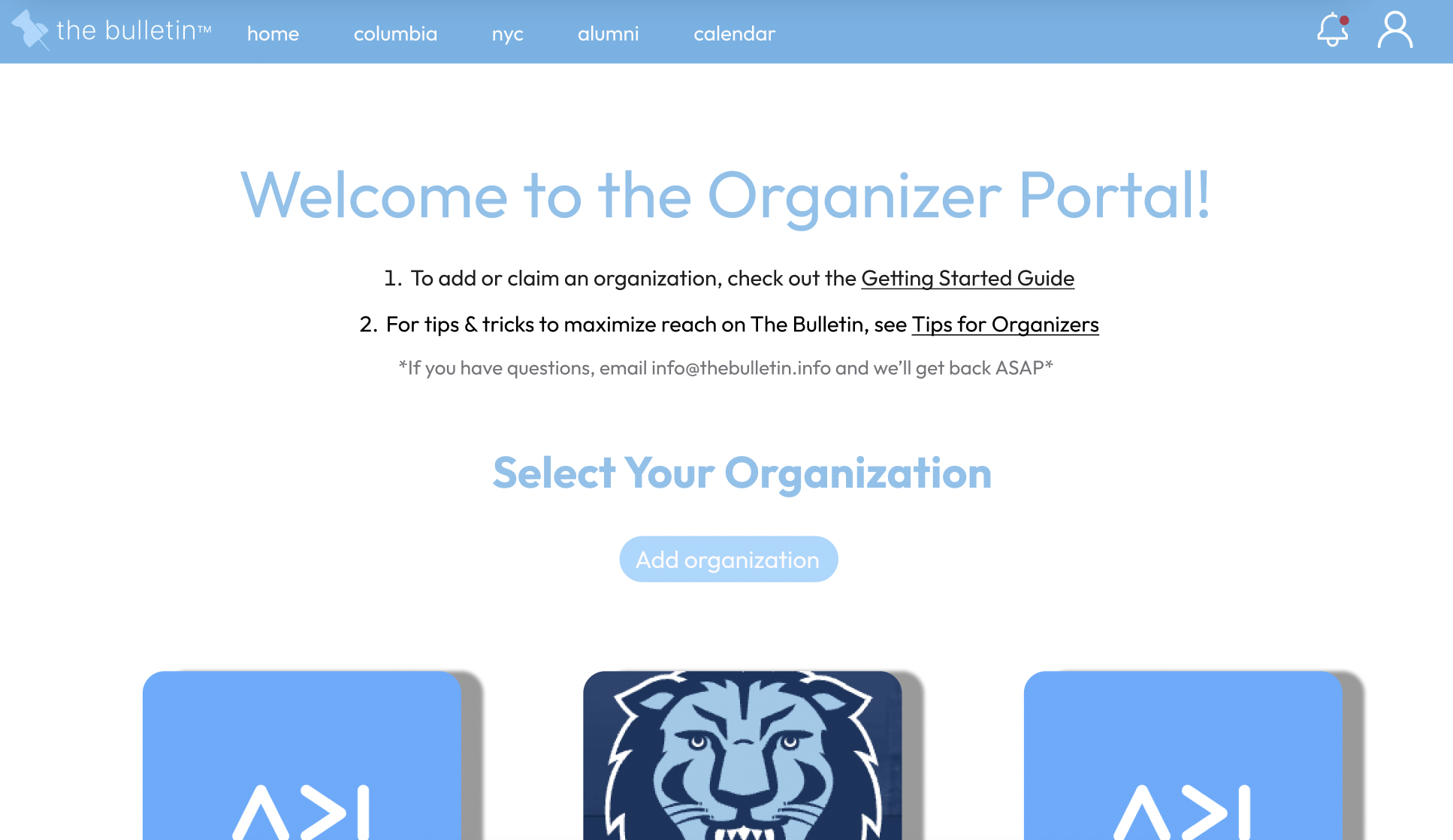
My second challenge was to redesign two other pages of my choice. I decided to focus on the organizer's perspective and designed the organizer's portal and organizer's profile page.
This was the initial design of the organizer's portal:
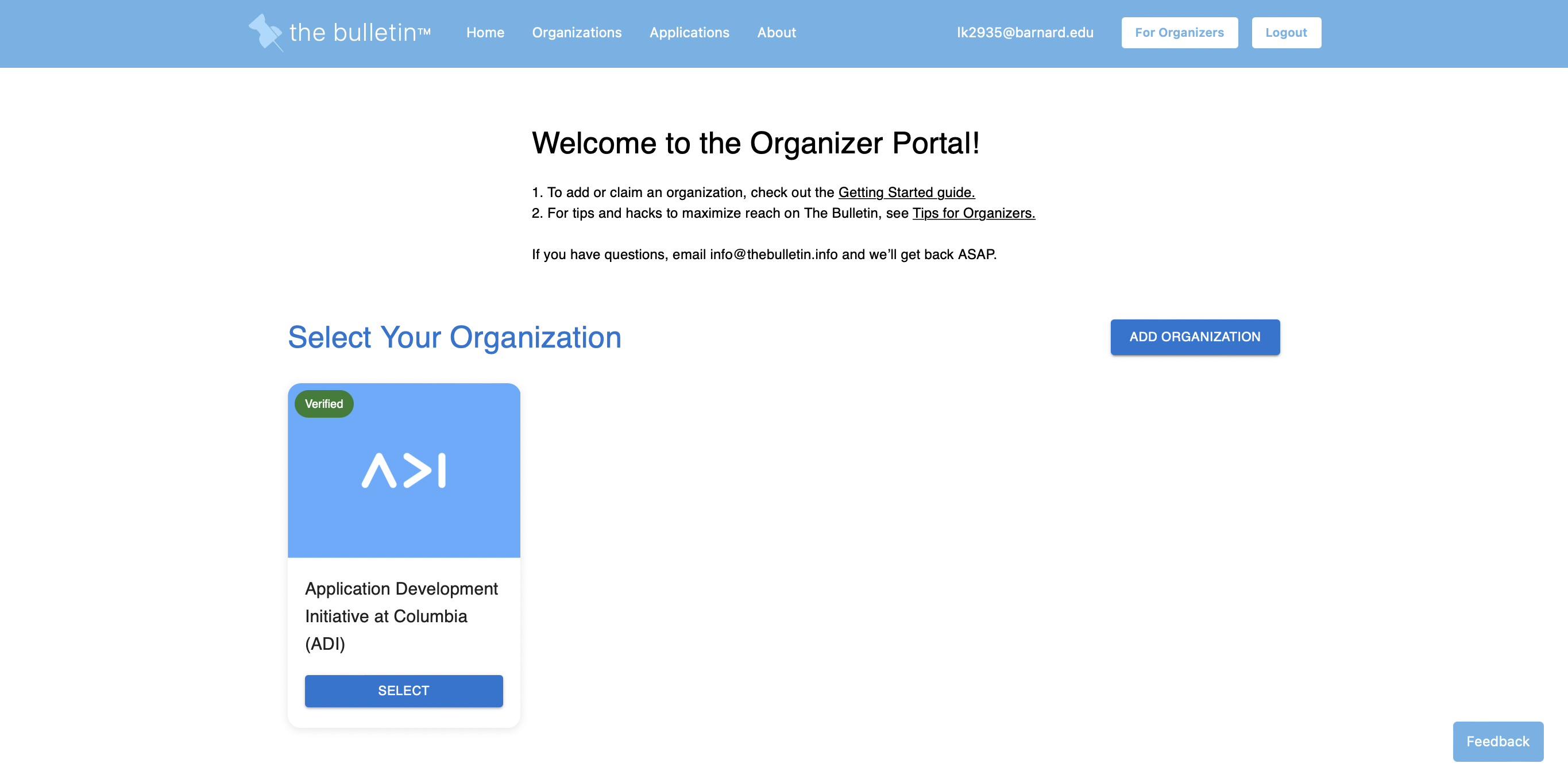
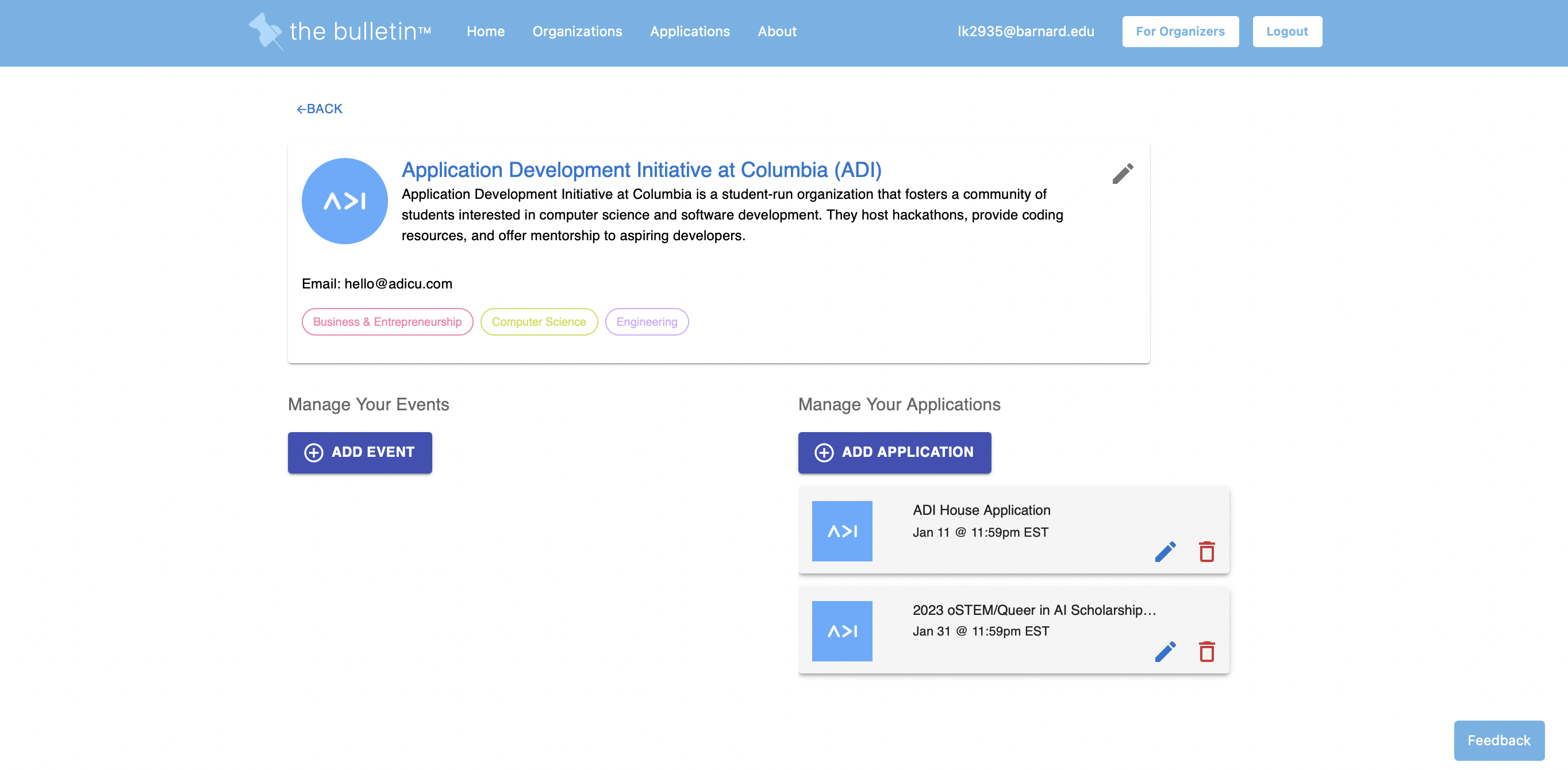
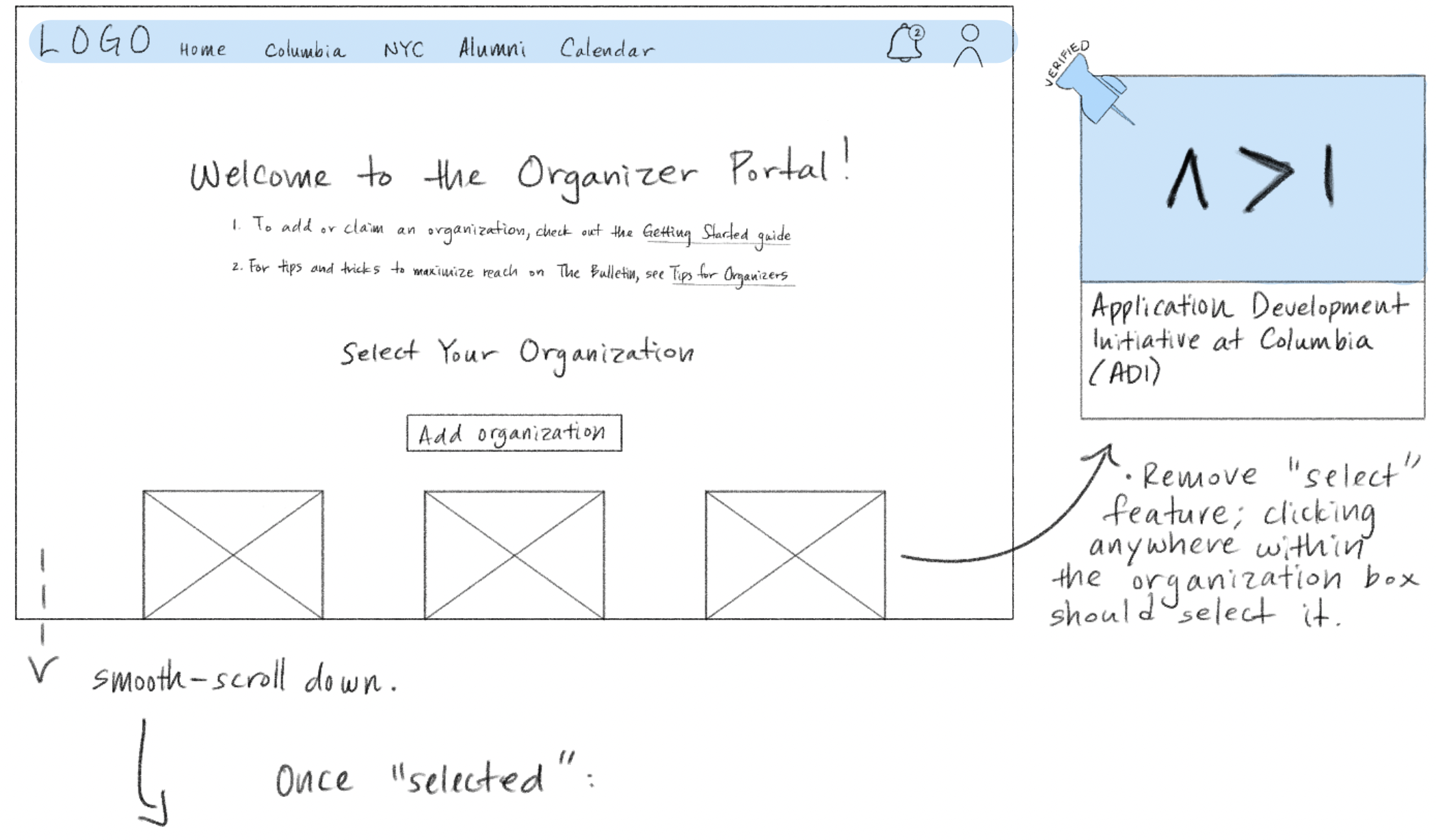
I wanted organizations to be able to track their performance. How many students clicked? How many people were actually engaged? Any new followers?
Although it may seeem trivial for university organizations to observe these metris, I decided it would be valuable for those seeking to promote engagement and grow their organization.
These metrics could be key to helping organizations raise more funding or for clubs to become officially recognized under Columbia University.
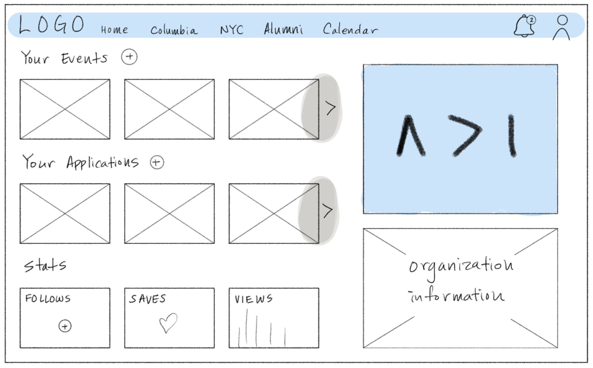
Although visual aesthetics were a primary focus of the re-design, I decided to put organization stats in the same space as the events/applications posted to ensure a smooth transition and easy means of comparison: which events and opportunities got the most engagement? Perhaps it was a specific style or title of the post that made all the difference?
3B. The Wireframing Process: Mobile App
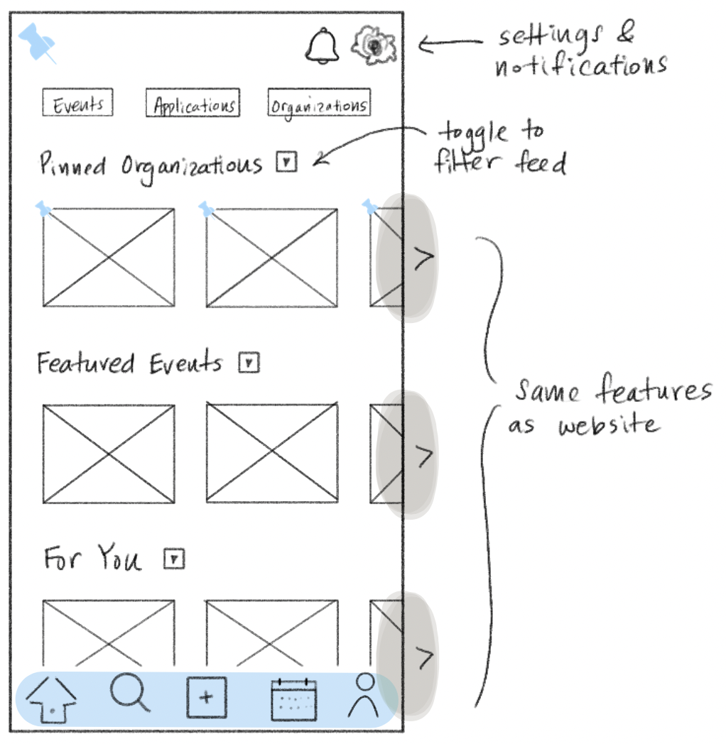
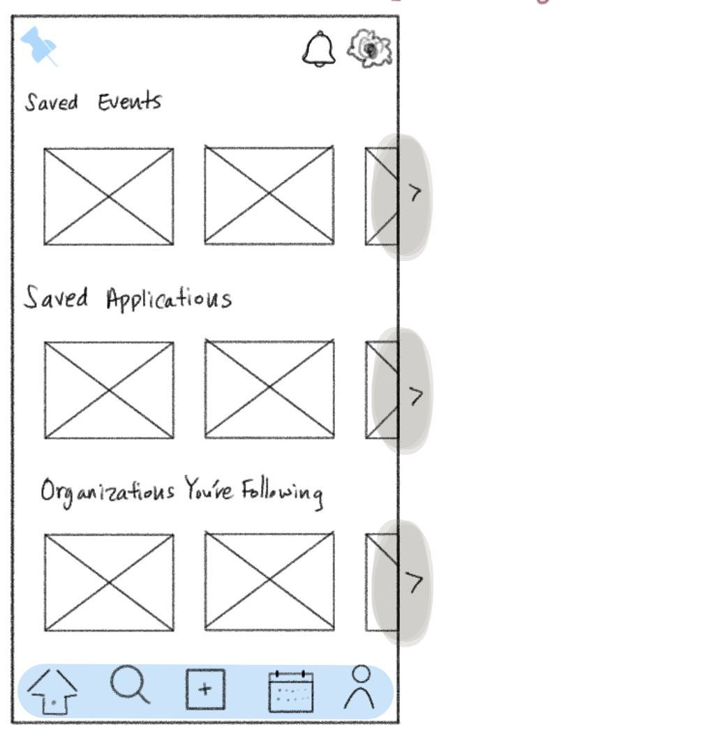
As with the website, my first challenge for the app was to re-design the homepage. I believe consistency across all platforms is crucial, and so I largely followed the structure of the new website homepage.
I wanted the profile page to feel more personal and task-oriented, so I separated the events, applications, and organizations that the user is following into separate feeds.
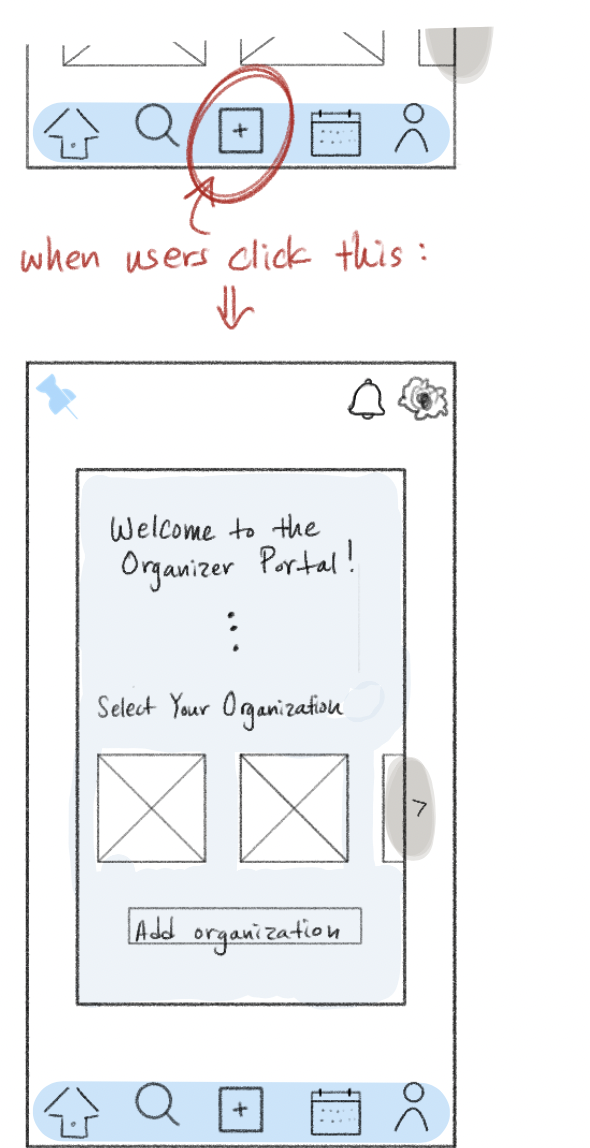
A new feature I implemented was allowing organizations to post their opportunities through the app rather than just the desktop. This new functionality wouild allow for a much larger number of app users and potentially encourage greater community engagement through an increase in posts.
Key Changes to the App:
- Adding the organizer portal to allow organizations to use the app as well.
- Notifications page-- this was also added to the wbesite and was implemented with the intention of sending users notifications on saved opportunities/trending events (only if enabled).
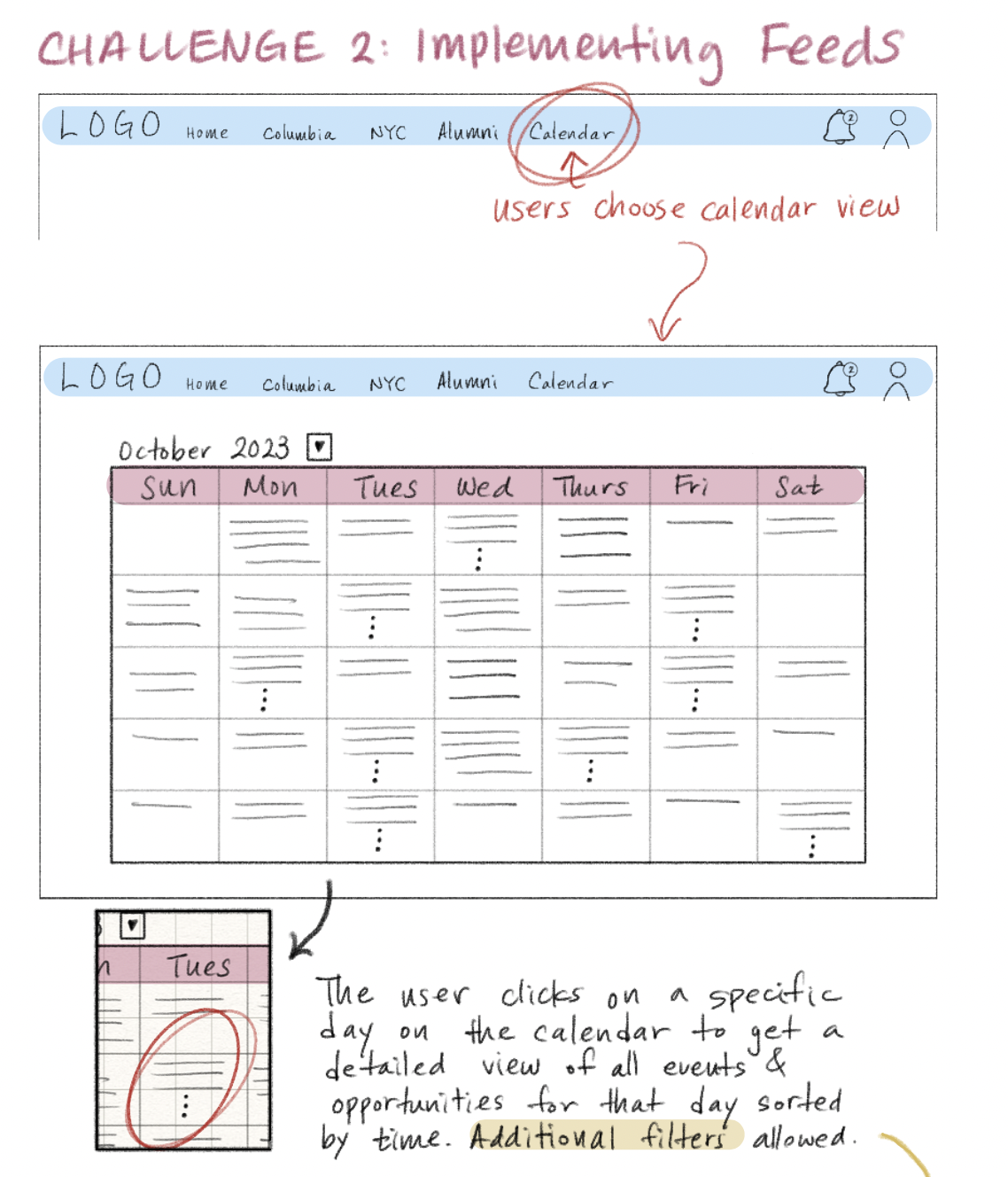
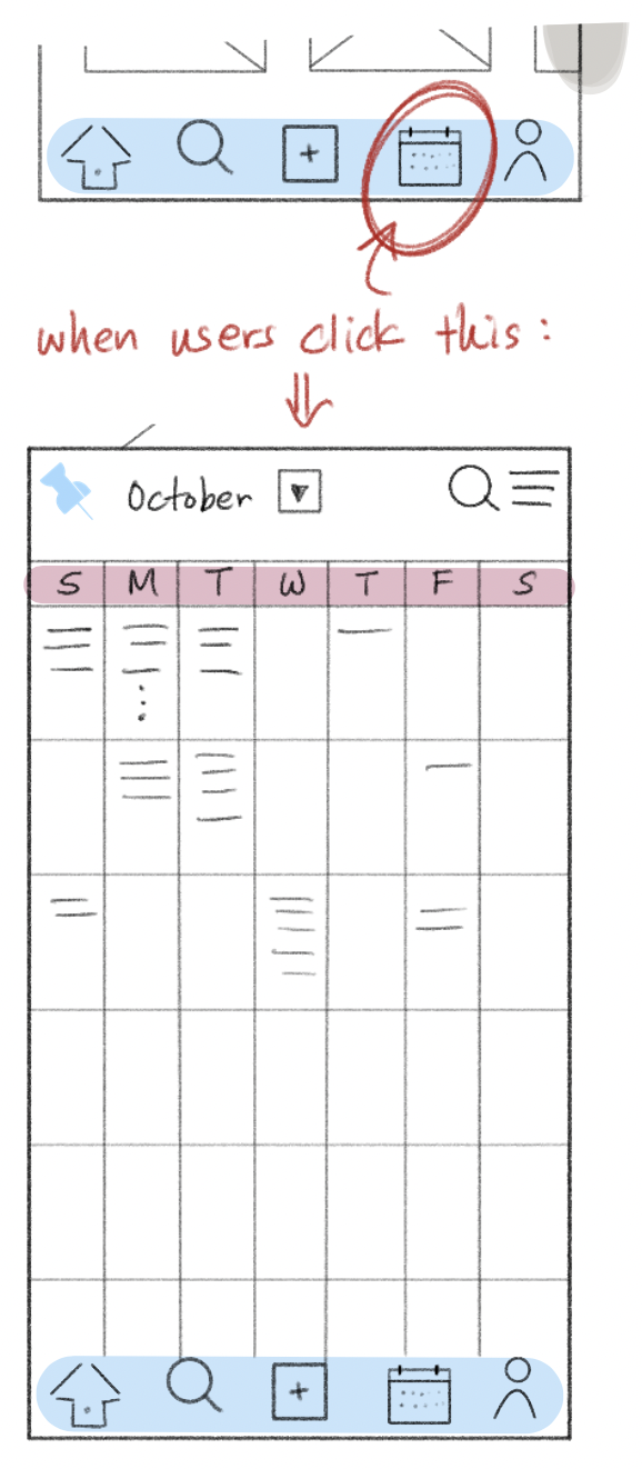
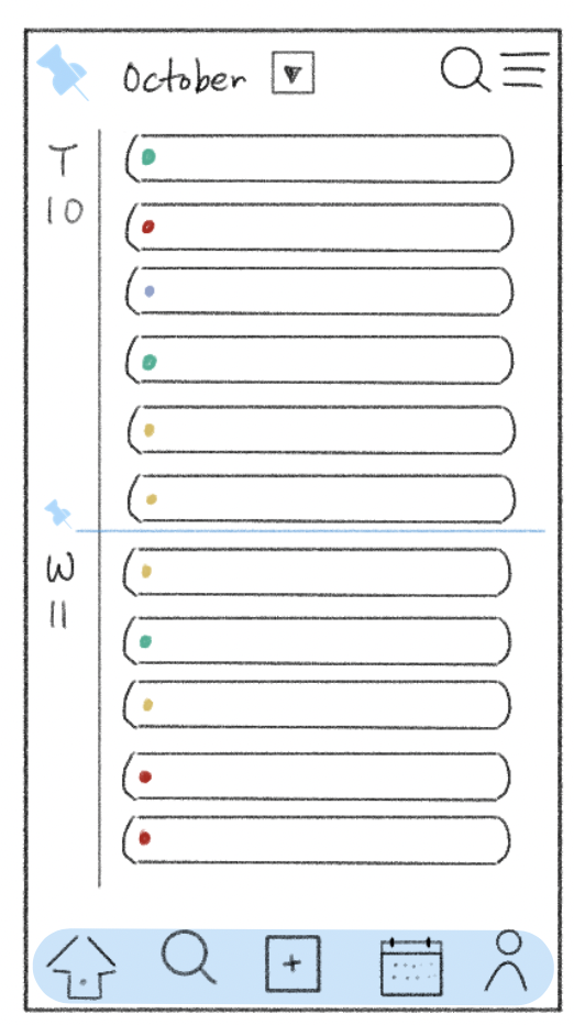
- A new navigation bar, most specifically the calendar-- this was also a new feature on the website that was never mentioned because I didn't want to take away from the focal changes required for Challenge #1. This calendar is a central feature that comprehensively satisfies all parts of Challenge #2.
An organization scheme that was right under our nose this whole time:
the Calendar
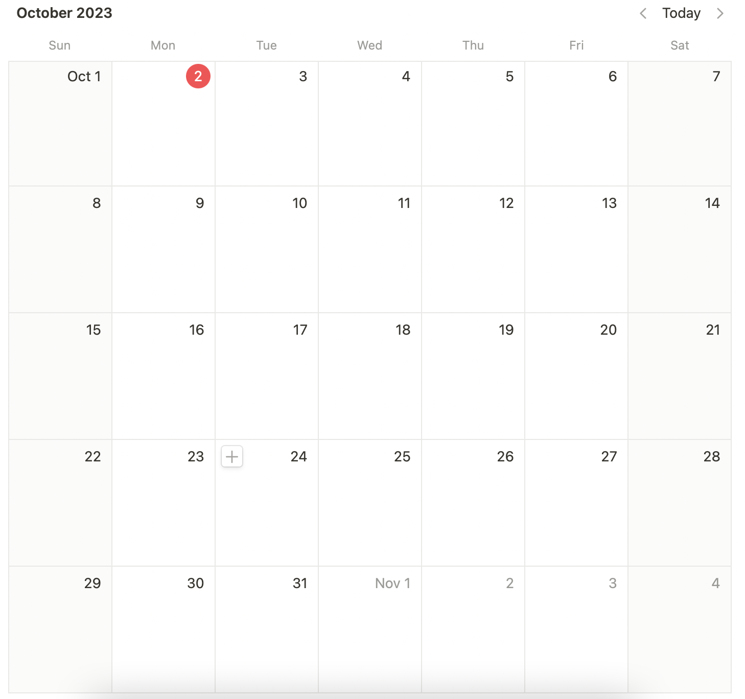
The Bulletin will always be overwhelmed with a myriad of events and applications, especially after the successful introduction of opportunities in all of NYC and making space for alumni in the platform.
Although filters are greatly helpful in organizing information by preference, I decided that having a visual calendar will provide a great big-picture overview of everything and anything happening each day.
Additionally, this feature is not forced-- meaning, users get the option to view this, separate from the gallery-view feed and filters.
The calendar miught turn intyo a limitless scrolling process if it showed every detail aboiut every event on each day.
This calendar view wouild serve as an ultimate feed of everything-- events, applications, and opportunities-- with Columbia University and NYC for all students, alumni, and organizations.
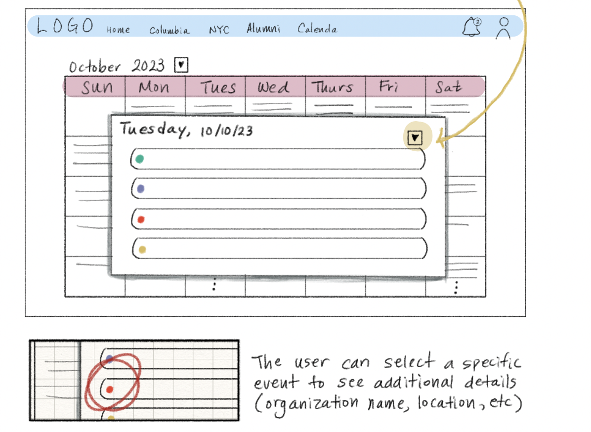
To keep the calendar compact, each "event" should be limited to a color tag that indicates its type and the title.
If users wish to learn more about the event based on the title, then they can click on it for an expanded view of that specific event.
A consistent feature throughout all of the redesigns has been a toggle option for filtering.
Figma Design Highlights
Website:
Homepage
Organizer Portal
